Wednesday, March 24, 2021
Taking Colour A Step Beyond Simple Harmony
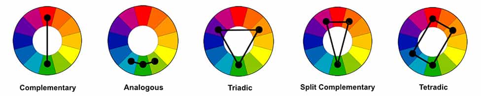
(Submitted by Jay Terry MPA). As every artist knows, a successful image has many elements to it: lighting, composition, a center of interest, impact and story. Each has a role to play in how an image is viewed and interpreted by the viewer. An image maker can, through their use of line, contrast and depth, influence how the viewer’s eye travels through an image and what parts of the image hold more “weight” than other. Each element can play off of another, enhancing their mutual effects, but one intersects and connects them all: colour. The right balance of colour can add either harmony or tension, depending on the intentions of the maker, by using any one of the principal colour schemes: monochromatic, analogous, complementary, split complementary or triadic, and finally, tetradic.
First, it’s important to review the basics. “Colour” is the general word we use when we’re talking about hues. A hue is any dominant, solid colour as seen in the spectrum, such as red, blue or yellow. They make up the primary and secondary colours with which we’re all familiar. Lighter colours (hues mixed with white) are called tints, darker colours (hues mixed with black) are called shades and muted colours (hues mixed with grey) are called tones. Technically, black, white and grey are not colours, but make up the greyscale.
Besides its specific hue, colours have three other characteristics. A colour’s value (also known as luminosity) is how light or dark it is in relation to a true neutral grey, saturation is the intensity of a given colour and, of course, a colour being warm or cool is referred to as its temperature. One could get lost down the rabbit hole of dissecting colour characteristics but, for the time being, let’s take a more practical approach and look at colour schemes specifically.
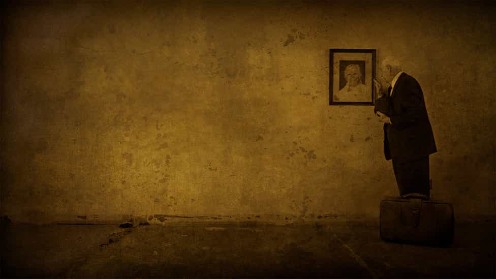
A monochromatic colour scheme is just what it sounds like: images featuring a single, dominant hue. Images that make use of a monochromatic palette have a considerable amount of impact for their visual presence. A single colour in an otherwise colourless scene or one colour that consistently dominates an entire picture grabs the attention of the viewer. While a monochromatic scheme is just one colour, it can include that colour’s full range of tints and shades, working to enhance and add depth to the primary, dominant colour.

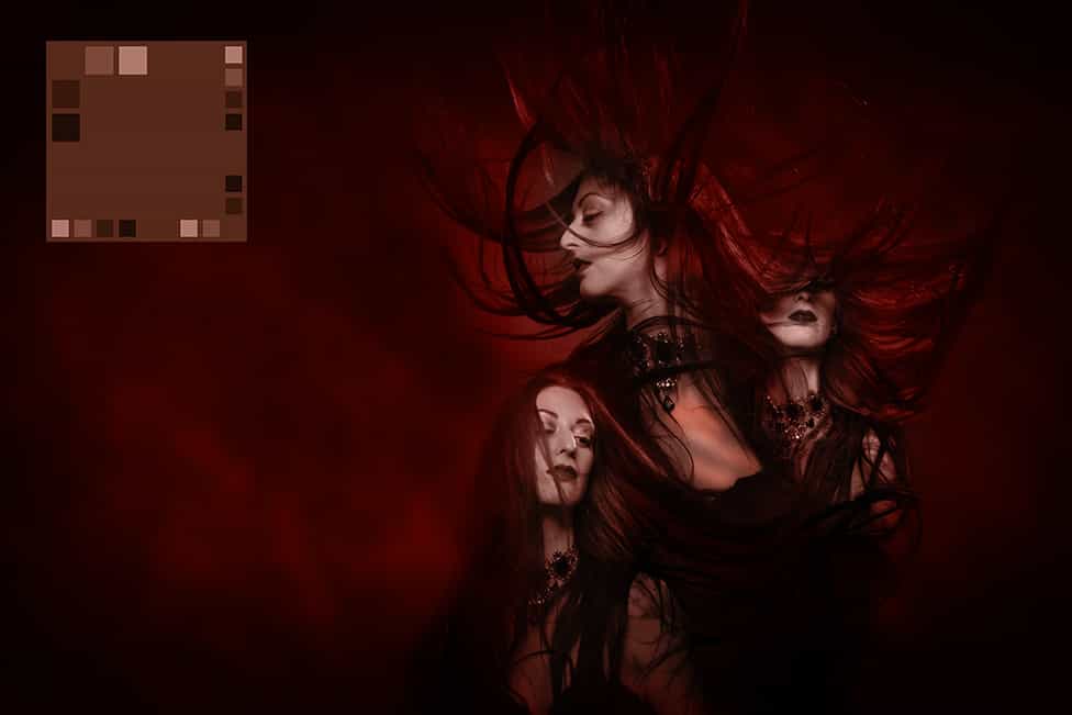
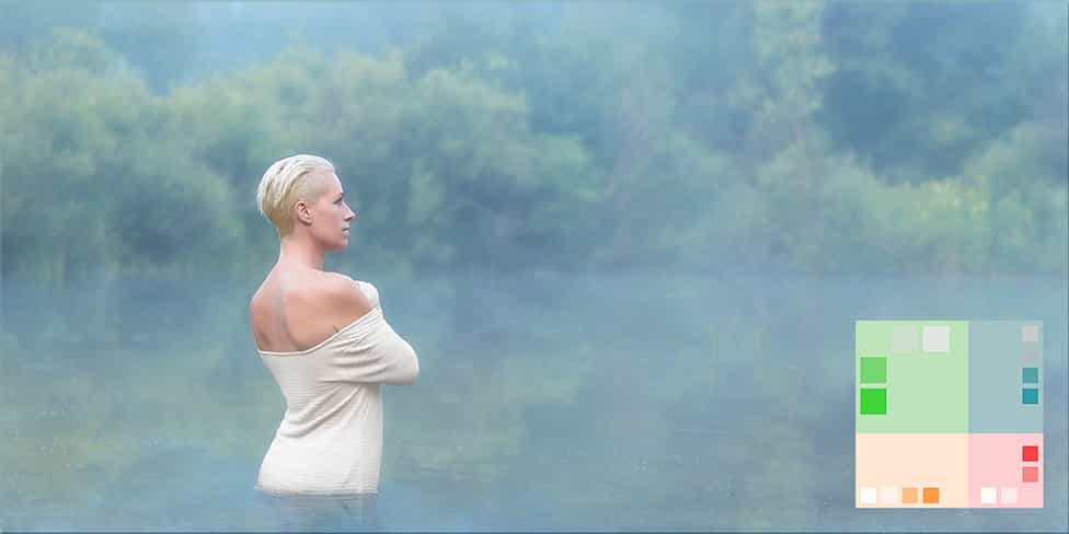
Complementary colour schemes are ones that employ colours that sit opposite each other on the colour wheel. While opposing colours create a high contrast, they also create a balance or perceptual stability. We most commonly refer to this as colour harmony. A basic two-colour complement will always contain one warm colour (red, orange, yellow) and one cool colour (blue, green, purple). Classic examples of this scheme would be warm highlights with cool shadows, or warm skin tones with a cool background.
Analogous colour schemes are ones in which any three colours sit directly next to each other on a colour wheel, such as green with cyan (green-blue) and chartreuse (green-yellow). While it seems like this would be a simple palette to create, certain three-colour analogous combinations can be disharmonious and distracting (especially when combining warm and cool tones). A good way to use analogous colour schemes is by having one colour act as a primary and the colours immediately adjacent used to support or accent the primary.

A triadic colour scheme is one in which three colours are equally spaced on the colour wheel. It is similar to the split complementary scheme, which also makes use of three colours, but split complementary uses one colour and the two directly on either side of its complement. The split complementary colour scheme is one of the more simple palettes to create as it’s comfortable to the eye with less of the visual contrast of direct complements. The easiest way to differentiate between the two schemes is to imagine a triangle on the colour wheel: an equilateral triangle for a triadic scheme, an isosceles triangle for a split complementary scheme. In either case, a standard method in using these colour schemes is to, again, set a base colour (the tip of the triangle) and then use the two complementary colours as accents.
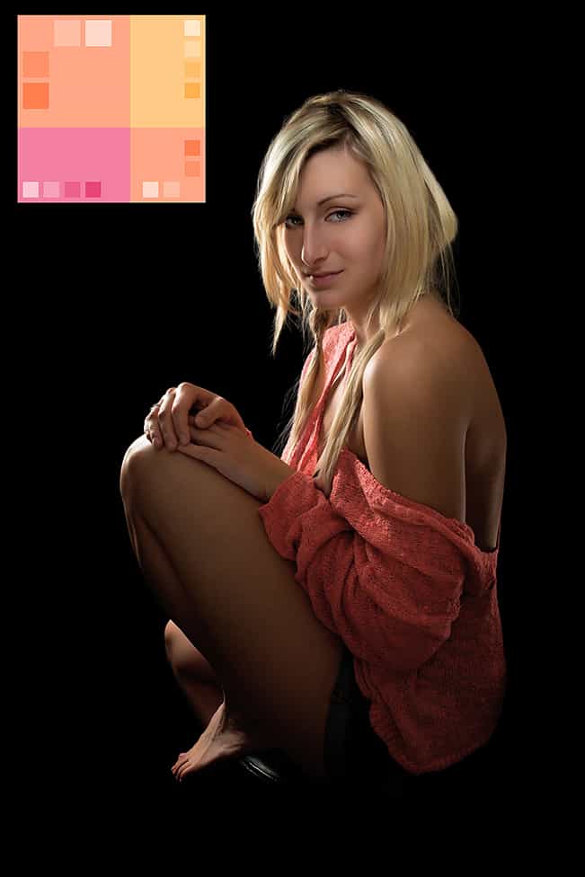
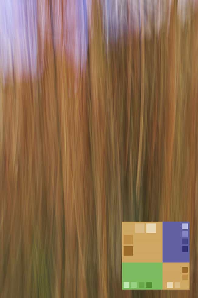
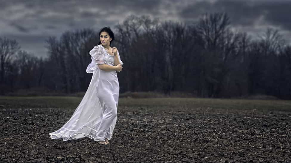
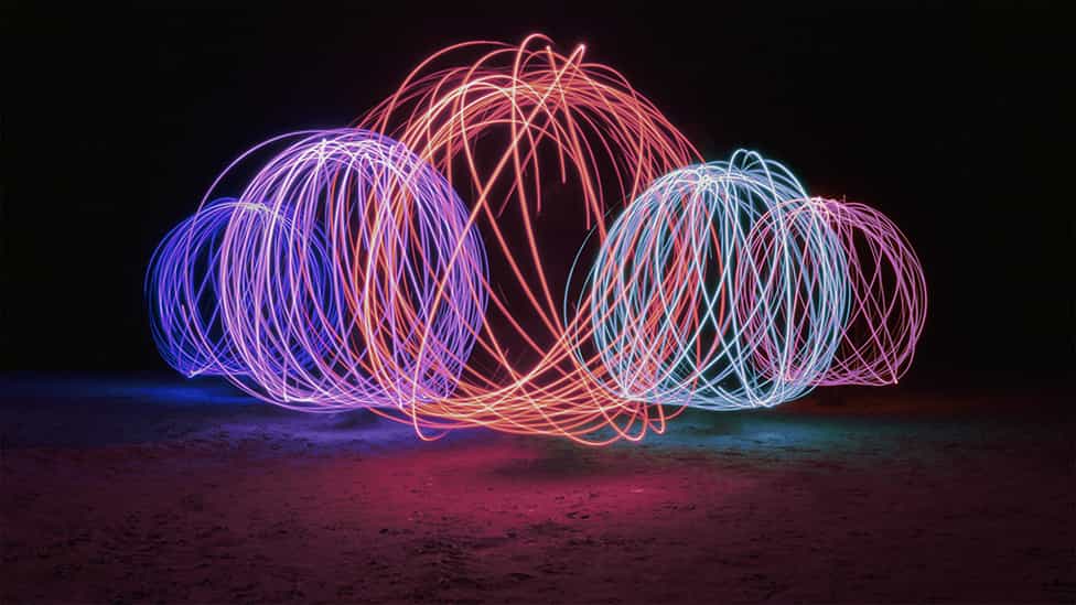
Tetradic colour schemes are ones that make use of four colours together as two sets of complementary colours rotated 60 degrees from each other (picture a rectangle on the colour wheel). Obviously the most difficult scheme with which to create a colour harmony, it can also be the most vibrant and jarring. A good example would be red and green paired with blue and orange. A general rule of thumb is that the four colours not be used in equal amounts but rather to use one complimentary set as primary and the other, less intense, as secondary. Using pastels (tints) can help make this colour scheme less obtrusive to the eye.
Using the right colour scheme comes down to a creator’s intention to set the mood and aesthetic that’s right for their vision, be that photorealistic or entirely creative. Balance is of key importance so as to not create disharmony. Just as line, shape and the use of positive and negative space can keep a viewer’s eye within the image or lead it out, so too can colour choices. Tension, on the other hand, can still exist within a harmonious colour relationship and is often used deliberately to create a specific emotional mood (consider Zack Snyder’s 2013 dystopian fantasy Sucker Punch and his colour choices to enhance each new sequence appropriately to that sequence’s theme).
The deliberate use of colour to set the emotional scene is of particular importance in post production using colour grading. This technique can be used for simply boosting existing colours to completely reworking the feel of a given image’s story. It is different from colour correction in that it’s a manipulation of the overall image in order to create a specific atmosphere, a visual mood, rather than ensuring colours are true to life. Often, colour grading makes use of applying colours that would be “unnatural” to the scene as it was captured in order to create a specific effect.
Psychology very much comes into play when colour grading images. As colours have temperature and value, they can be used to complement the subject and/or scene, or to contrast it in order to create tension. A horror image can be created by using a variety of deep greens to colour a little child’s room or a science fiction vibe will often be created by toning a scene in dark blues while the shadows are deepened. A simple desert vista toned with oranges creates a Martian landscape, while mystical fantasy scenes can be enhanced with tones of purple. By the same token, images can be colour graded in ways that evoke emotional responses. Reds for either passion or anger, yellows can bring to mind happiness or insanity, pink to show innocence and playfulness, or cyan for melancholy or calm.
With colour grading, how simple or complex the toning being used is entirely up to the image maker. Monochrome colour toning is, obviously, the easiest and most straightforward, often used for an immediate impact. Split toning allows the maker to apply one colour to the shadows and another colour to the highlights independently. Full colour grading allows for adjustments to the shadows, highlights AND midtones in order to fully manipulate the depth of a scene’s colour range by manipulating the hue, luminosity and saturation of each individually. While colour grading is often done globally, affecting each tonal range of the entire image, additional local adjustments to selective areas will add even more depth and allow the image maker to better direct the viewer’s eye within the frame.
Ultimately, the simplicity or intricacy of the colour manipulation being used will be determined by the artist’s vision and needs of the story being told.
While it’s easy to get caught up in balancing exposures, carefully composing scene and subject, and artfully determining the ideal depth of field for your images – all of which are admittedly important – don’t forget to be just as mindful in how you use colour. Even when there’s no camera at hand, pay attention to the colours all around you. The more you get used to looking for the interplay of colours - what works, what doesn’t and understanding why - the more insightfully you’ll be able to use different colour palettes to maximum effect and add another dimension of design to your photography, both before and after clicking the shutter.
Author’s note: there are several great resources for determining which colours work well together, including COLOURLovers, Coolers and Paletton. On sites such as Coolers (www.coolers.com) or Paletton (www.paletton.com), you can use the random colour palette generator or “lock in” your own colours and then save the swatch. COLOURLovers (www.colourlovers.com) has detailed sections diving into colour combinations for branding and website design, as well as what’s currently trending.
Jay Terry MPA is a commercial and portrait photographer in London, ON, and a 2x ON Portrait Photographer of the Year. You can see more of his work at https://jaytphoto.ca/